A name rooted in the product.
I developed the name Tellura from tellus, the Latin word for earth, connecting the identity to truffle hunting and its regional context.
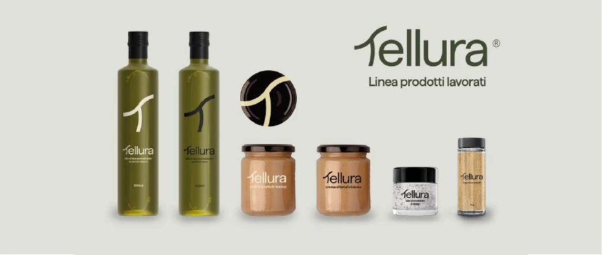
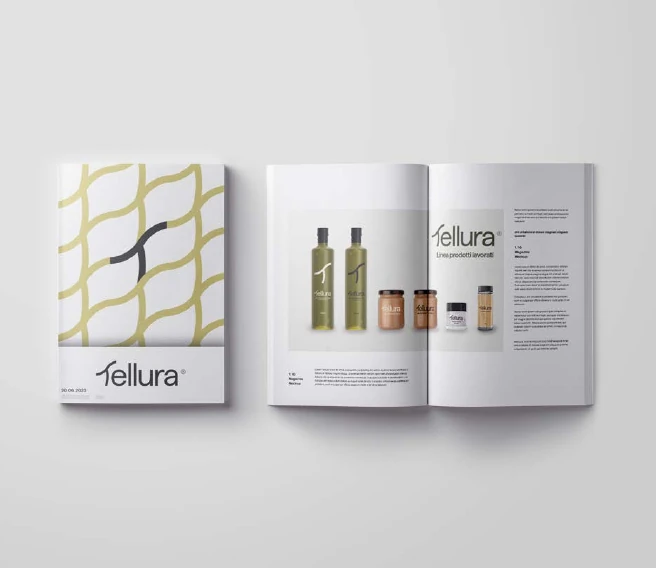
The logo draws on the internal structure of a truffle. Typography and colour establish a consistent identity across packaging, editorial layouts and digital mockups.
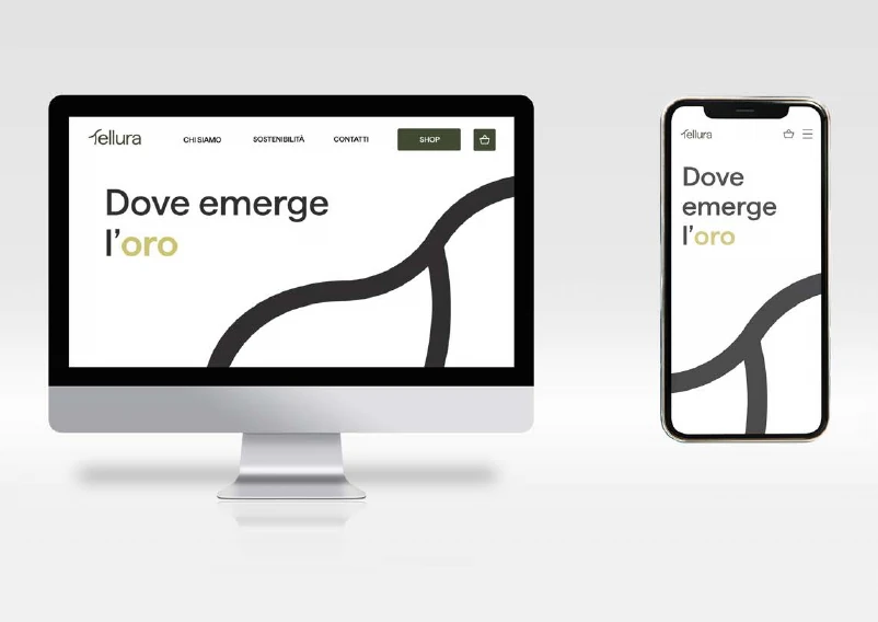
Website and app mockups show how the identity extends to screens. The mockups apply the same typography, colours and graphic elements across screen sizes.
Outcome
A shared visual language spanning naming, identity, packaging and digital applications.